

At AldoMedia we can convert your existing website to be responsive. This new technology is quickly growing and we have even designed our own website to be responsive. Google officially announced it prefers responsive design vs. mobile web design. Although in very rare cases its right to build a separate mobile website.
Your website will respond based on what screen size it has to display its content and graphics on. When we design for responsive, we check and double check your programming and design on laptops, desktops, tablets and mobile phones. Things got more complicated for us designers but its all in the benefit for web users and customers.
Schedule a Visit
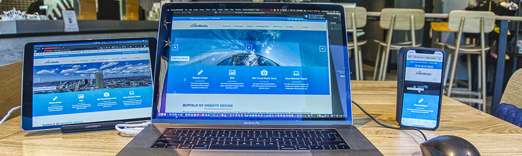
Both the responsive web designer and the consumer benefit from responsive design, why? Well here's why . . ..
- Consistent Content - only update content and images in one single place.
- Better Search Engine Optimization - Google officially announced it prefers to index one website, and rankings will increase from the same URL and page information.
- Happy Customers - your visitors will have a consistent experience coming to your site on all electronics and screen sizes.
Areas Served | Industry Specific Website Design | Privacy Policy | ADA Compliance
Copyright © 1999 - 2024 AldoMedia, LLC. All Rights Reserved.